The Craft Has No Postcode: 25 Years of CGI Across Every Sector.
- Richard Wright

- May 14
- 6 min read
Richard Wright | Wright Thinking
People sometimes ask me whether I specialise. It's a reasonable question. The Digital Twin industry, like most creative industries, has a tendency to sort itself into verticals — automotive studios, architectural visualisation practices, beauty and lifestyle specialists.
There are good commercial reasons for that.
Specialisation builds expertise, attracts like-minded clients, and creates efficient pipelines for a particular kind of work.
I've never worked that way. And looking back across twenty-five years of projects, I think that breadth has been one of the most valuable things I've built — not despite the range, but because of it.
Because here is what working across almost every product category teaches you: the craft doesn't change. The subject changes. The client changes. The brief changes.

But light, material, composition, and emotional truth are the same whether you're shooting — in the digital sense — a supercar or a bottle of nail varnish. The fundamentals are universal. And the studios and leaders who understand that tend to make better work in every sector they touch.
What follows is a journey through the sectors I've had the privilege of working in. The images alongside this post are from the Burrows back catalogue — work I'm enormously proud of, made by a team I was fortunate to lead, for clients who trusted us to make their products look extraordinary.
On the Road and in the Air: Vehicles
Cars were where my CGI career found its footing, and automotive work remains the most technically demanding visual discipline I know. A car is an object of almost pathological visual scrutiny.

Enthusiasts know every surface, every highlight, every reflection. The light that wraps around a bonnet, the way a tyre sits on the ground, the quality of a painted surface under direct sun — all of it is examined, consciously or not, by anyone who looks at the image. There is nowhere to hide.

Motorbikes take that challenge and compress it. Less surface area, more exposed mechanical complexity, an object that communicates attitude as much as engineering.

Getting a bike to feel alive in a still image — aggressive, purposeful, planted — is a specific skill.
Planes introduced a different set of problems. Scale, for one — communicating the sheer size of an aircraft in a way that a camera angle alone can't always achieve.

And context: an aircraft without a convincing environment looks like a toy. The sky, the light, the ground beneath — these aren't background elements. They're half the image.
Food and Beverage: The Hardest Subject in the Room.
Ask any CGI artist which category keeps them up at night, and a significant number will say food. There's a reason for that.

Food photography has a century of craft behind it. The way a strawberry glistens, the translucency of a glass of wine, the steam rising from a cup of coffee — these are things the human eye recognises instantly as right or wrong, without being able to articulate why. The bar is extraordinarily high, because everyone has a reference point. Everyone knows what a perfect glass of beer looks like.

Getting food and beverage right in CGI requires not just technical mastery of materials and lighting, but a genuine understanding of what makes food appetising — which is as much a psychological question as a visual one.
Work I'm proud of in this category. Work the team genuinely had to fight for.
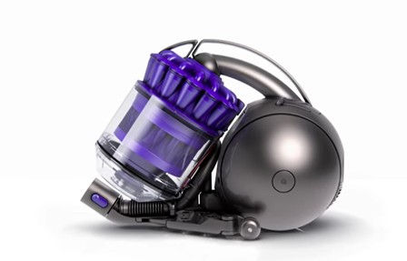
Technology: Phones, Cameras, Headphones, Coffee Machines, Vacuum Cleaners

Consumer electronics and technology products are where precision lives. These are objects engineered to extremely tight tolerances, and the CGI has to reflect that.
A speaker grille with geometry that isn't exactly right.
A camera body where the texture of the grip is slightly off. A headphone hinge that doesn't sit at quite the correct angle. The viewer may not consciously register the error, but they feel it — as a vague sense that something isn't quite real.

What I've always found interesting about technology products is the relationship between form and function.
The best-designed consumer electronics tell you what they do by the way they look. A good CGI brief for a technology product isn't just "make it look beautiful" — it's "make it look like it does something remarkable." That's a more interesting problem, and a more interesting brief to answer.

Coffee machines and vacuum cleaners belong in the same sentence as phones and cameras because the visual challenge is similar — but the context of use matters more. A coffee machine needs to look at home in a kitchen. A vacuum cleaner needs to suggest effortlessness.
The product and its world are inseparable, and the CGI has to hold both.
Beauty and Lifestyle: Jewellery, Makeup, Skincare, and Fragrance
Jewellery is, in my experience, the single most technically demanding product category in CGI. The materials — gold, silver, platinum, diamond, gemstone — are among the most optically complex substances in the world.

A diamond is not one thing: it is a thousand different light interactions happening simultaneously, and each one has to be correct. The scale is tiny. The expectation is absolute perfection.

There is no category where the gap between almost right and exactly right is wider, or more visible.
Skincare, nail serums, shower gels, and soaps present a different kind of challenge — the pack shot.

No context, no lifestyle, no environment to lean on. Just the product, isolated, expected to carry everything on its own.

It sounds simpler. It isn't. When there is nothing else in the frame, the quality of the render is the only thing the viewer is looking at. Every surface, every label, every material interaction with light has to be exactly right.

There is no supporting cast to draw the eye away from anything that isn't perfect. Pack shot work taught me that restraint is a discipline —
and that the most demanding brief is sometimes the one with the fewest words in it.
The Built Environment: Exteriors and Interiors
Architectural visualisation sits slightly apart from the other categories, because the product is a space rather than an object — and space is experienced rather than observed.

The challenge of visualising a building exterior is largely one of scale and context: making a structure feel grounded in a real world, with real weather, real light, real surroundings. Getting that context wrong — a sky that doesn't match the lighting, shadows that fall at the wrong angle — destroys the illusion completely.

Interiors are more intimate, and in some ways more demanding. A room is a place where someone will live, or work, or stay. The CGI has to make them feel that — has to communicate warmth, or calm, or excitement, as the brief demands.
Materials matter enormously: the difference between a floor that looks like wood and a floor that looks like a photograph of wood is the difference between a believable room and an obvious render.
Most recently this work has taken me into the world of property development visualisation — helping housebuilders and developers show clients homes that won't exist for two years. The stakes, and the craft demands, are the same. The context is just even more commercially direct.
The Team Behind All of It
I want to say something that doesn't always get said in posts like this: none of this work was made by me alone.
The images in this post represent the output of a remarkable group of people — artists, technical directors, project managers, and creative leads at Burrows and Hogarth who brought exceptional skill and genuine dedication to every project we worked on together.
I know that many of them are reading these posts, and I want them to know that I see it, and I'm grateful.
My job was to set the vision, hold the standard, win the work, and build the culture that made doing it properly feel like the only option. The work itself — the lighting, the modelling, the compositing, the relentless iteration toward something that was actually extraordinary rather than merely good — that was them.
The best thing a studio leader can do is put the right people in a room, give them a clear brief and a high bar, and then make sure nothing gets in the way of them doing their best work. I tried to do that. On the evidence of what we made together, I think we got it right more often than not.
What the Breadth Teaches You
Twenty-five years across cars, bikes, aircraft, food, jewellery, technology, beauty, and buildings has given me something that I've come to think of as one of my most useful professional assets: the ability to read a brief in any category and understand, quickly and instinctively, what the visual challenge actually is.
Not the technical challenge — though that matters.
The visual challenge.
What does this product need to communicate? What does the audience need to feel? What's the single most important thing the image has to do, and what would get in the way of it doing that?
Those questions are the same in every sector. The answers are different every time. And the practice of answering them — across an enormous range of product categories, for an enormous range of clients, with an enormous range of briefs — is, I think, what makes the difference between a capable studio and an exceptional one.
The craft has no postcode. It travels. And the further it travels, the stronger it gets.
By Richard Wright


Comments